Choosing a color scheme for your website

When it comes to the design of a website, the color scheme is often what defines the entire project. The color scheme sets the tone for the design layout - which forms the foundation on which the developers build. Choosing the color scheme for a particular project is always an exciting challenge for both UX designers and graphic artists.
It's very easy to neglect the importance of color as it relates to design, however, this should be a key focus. Colors are expressive; they stimulate the brain and communicate meanings that influence our interpretation of the objects around us. They affect our perception of our environment, how we interact with our environment, and even our moods and physical condition.
Choosing the right color scheme for a particular purpose.
1. Background checkTo begin with, you need to acquaint yourself with the brand, individual, company, or business for which you are creating the site. Asking the right questions is usually a great way to start. You would need to ask detailed questions and make sure they are answered in the 'language' you actually understand.
You should also try to determine the exact purpose for the site, as well as the impression the site seeks to portray to its visitors. Who is the target audience? What type of site is it? Is it an information portal, e-commerce or corporate website? Is it for inspirational purposes e.g. a church, or for a philanthropic body - for instance, an NGO?
The answers to these questions can help you decide the appropriate colors for the site and, at the same time, set the right 'mood' for the site's visitors.
2. Color combinations
A general idea of the types of colors available in a prism and which colors work best together is very useful. Colors exist in groups such as: primary, secondary, tertiary, complimentary, analogous, neutral, etc. The easiest way to study the different groups is using the color wheel:
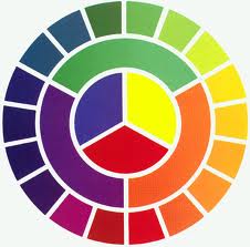
Complimentary colors usually work best in UX design since they make for better legibility -- of course if used in the right shades.
3. Psychology, symbolism, and meanings
Again, the cultural symbolism and meanings associated with the different colors is as important as the site's color symbolism; to represent or place emphasis on something that is usually specific to a particular culture or business. For instance, Red may symbolize aggression, sexuality, confidence, courage, danger etc, but when combined with black in some Western African cultures as in Ghana, it represents deep sorrow and grief. White is used in some Eastern African cultures for mourning and funerals but used for happy occasions in the West.
Aside the symbolic cultural meanings associated with colors, colors are useful branding tools. Businesses adopt certain colors for brand image -- these colors tell the viewer which company is being referred to. A restaurant might use more reds, yellows and greens for their web presence because these are the colors of foods and vegetables but you may want to consider greys, blues and black for corporate sites, as these show maturity, security, and confidence. Color is more than just a combination of two or more shades. It is one of the non-verbal methods of effective forms of communication.
From my experience, understanding the symbolism of color can aid in matching colors effectively to harmonize and complement each other. It's often advisable to, as much as possible, avoid using more than three sets of colors for a site as this could create visual noise and repel visitors.
Lastly, a website is crucial to the success of a business; draw inspiration from Nature.
Good luck.
Comments
No comments yet.